An editorial system to bridge narrative and illustration on an international scale
CHALLENGE AND SOLUTION:
The challenge consisted of creating a magazine from scratch. LaCabeza was born as a free Ibero-American publication, designed to connect writers and illustrators from various countries under the visual concept of a map.
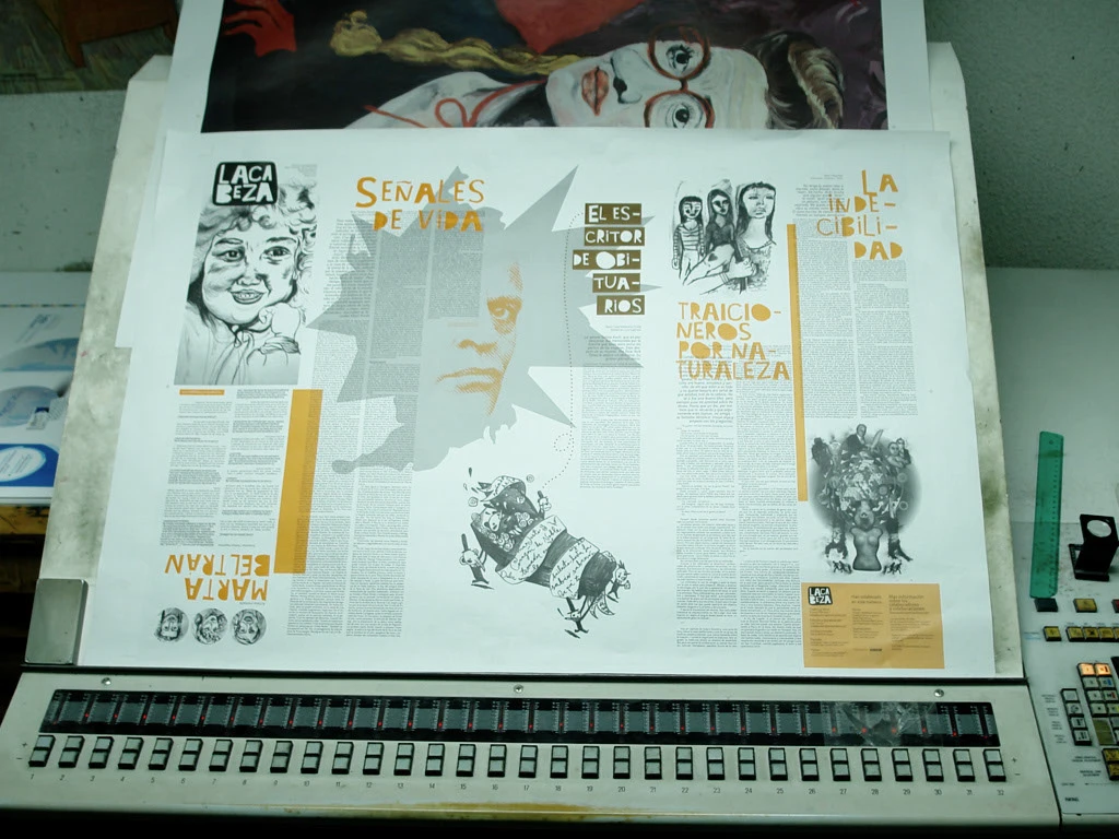
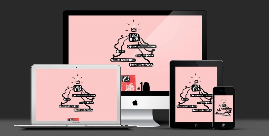
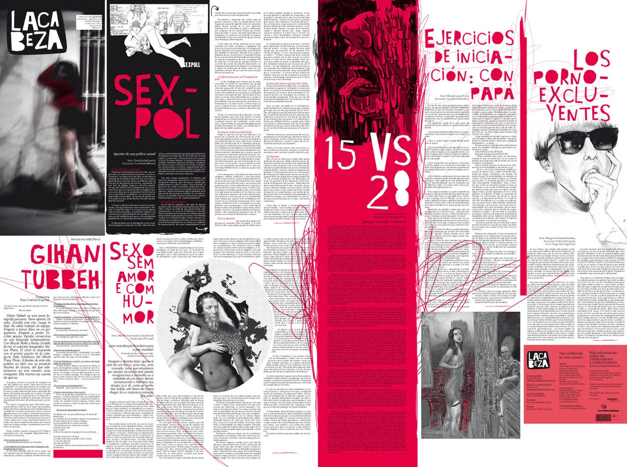
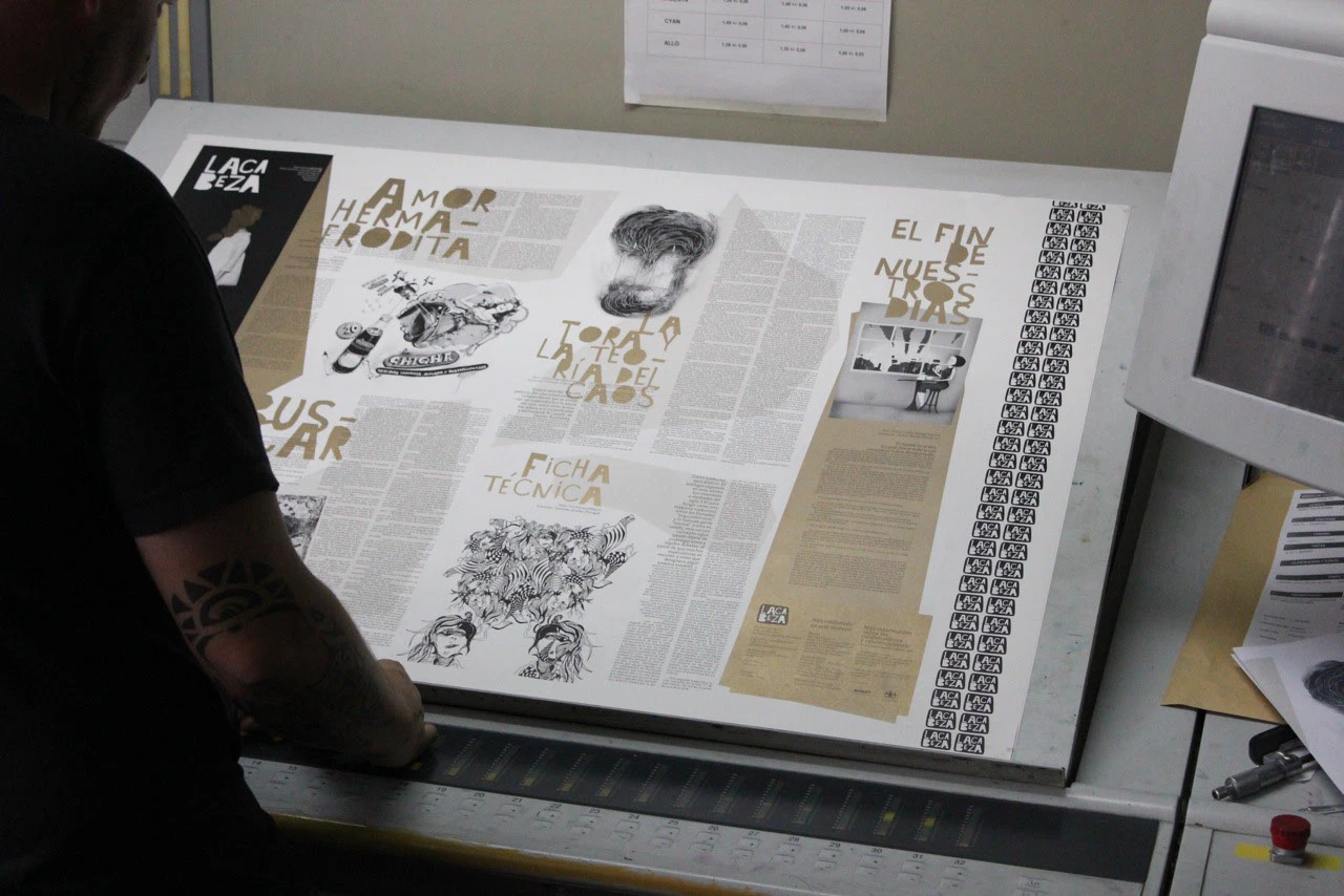
The editorial solution was a fold-out format centered on visual power: a poster on one side and an interview with illustrated texts on the other. For the graphic identity, we developed the logo and custom headline typography (LACABEZA). We chose the Lacuna font for its clean and modern aesthetic, creating a balanced contrast with a free-style underground layout.
The project spanned 10 issues, each featuring a full-color poster and a "B-side" printed in two inks (customizing each edition with a different spot color). Supported by AECID, the magazine achieved distribution in over 25 countries.
RESULT:
- Recognizable editorial identity
- Adaptable system
- Distribution in over 25 countries